Client-Ready Designs · Part 4
The best chat interface is the one nobody mentions. It feels natural enough that you forget you're typing to a model instead of talking to a person. It's easy enough that you never have to think about how to phrase something. It stays out of the way of whatever you were already doing, and it never becomes the only way to get something done. None of that shows up in a design review. It only shows up when it's missing.
I spent the last two weeks directing Claude Code through a run of fixes to the chat assistant inside deckhandAI, a self-hosted job-search tool I built agentically from scratch. Every one of those fixes started the same way. Something that looked simple, like rendering the AI's reply or scrolling to the newest message, turned out to have a specific, non-obvious failure mode once real conversations hit it. This is a walkthrough of four of them, and what they taught me about designing a conversational surface when an agent is doing the drafting.
It Started as an Evening Experiment
The chat assistant wasn't on any roadmap. I added it to the board in an evening just to see if it would hold together. Give it a handful of tools: add a job, move it between stages, flag a ghost posting, search for remote roles. Let it operate directly on the same data the board renders. It worked well enough that it stayed, and it kept absorbing more of the app's surface area from there. Scraping for new postings moved from a header button into a chat prompt. Evaluating a job posting from a URL moved from a form into a conversation. The assistant went from a nice-to-have to the primary way I interact with my own board.
That migration is exactly why the small stuff started to matter so much. A chat assistant that's a minor feature can get away with rough edges. A chat assistant that's become the primary interface cannot. Every rendering bug, every scroll glitch, every ambiguous instruction now shows up on the first minute of every session, not once a quarter.
The List That Forgot How to Count
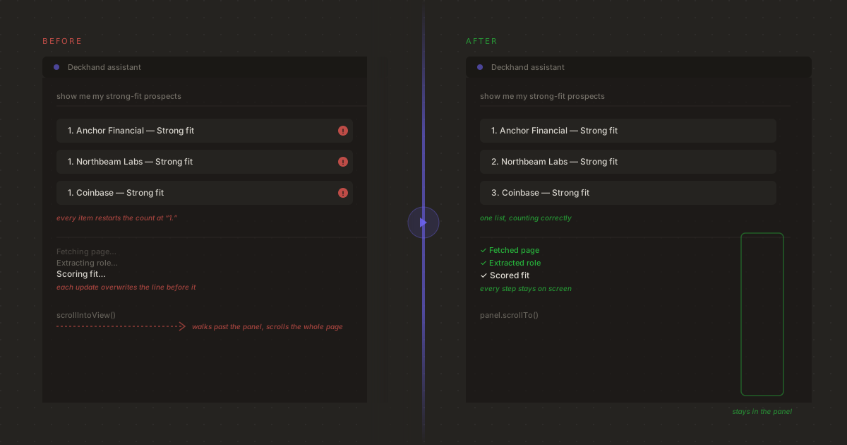
I noticed the first bug while shooting product page screenshots, of all things. I asked the assistant to list my strong-fit prospects and every single item in the reply came back numbered “1.” You can see the error in the video, every red flag is counted as one. The model wasn't confused. It was emitting a perfectly normal ordered list. The renderer was the problem.
LLMs commonly write what markdown calls a “loose” list, with a blank line between every item. That's valid markdown and it reads fine as plain text. The list parser in the chat panel treated a blank line as the end of the list instead. Five items with blank lines between them became five separate one-item lists, and every fresh <ol> restarts its own counter at one. The fix was small: tolerate blank lines between list items instead of splitting on them. Finding it meant noticing that the bug wasn't in what the model wrote. It was in an assumption the renderer made about how models write.
The same pass turned up two siblings of that bug. Markdown tables weren't rendering at all, so a reply like “show me my strong-fit prospects” printed raw | Company | Role | pipe syntax instead of a table. And the model would occasionally hallucinate a placeholder link like [Anthropic](/), because the tool response it was working from never gave it a real URL to link to in the first place. Once that tool response started returning an actual detail-page link for every job, the placeholder links stopped. Not because the model got better instructions. Because it stopped needing to invent something that wasn't there.
The Scroll That Left the Room
The second bug was more disorienting to experience than to explain. Mid-conversation, while the assistant was streaming a reply, the entire page would jump. Not the chat panel. The whole board scrolled out from under you. The culprit was a single call to scrollIntoView meant to keep the newest chat message in view. It was walking up the DOM's scroll-ancestor chain looking for something scrollable, and on the two-column board layout it found the page itself before it found the message list the panel actually wanted to scroll.
It's a small distinction. Scroll this list, or scroll the nearest scrollable ancestor. But it's the difference between a chat panel that feels contained and one that hijacks the page every time it updates. Auto-scroll is trivial to get 90% right, and easy to ship without ever testing it inside a layout that has more than one scroll container.
Two Actions Wearing One Verb
The third failure was less a rendering bug than a language problem. Asking the assistant to “evaluate” a job posting could, some of the time, silently file it straight into Prospects instead of leaving it in a pending queue for review. Evaluating and adding a job are adjacent enough actions from the model's point of view that the line between them blurred under the wrong system prompt. From the user's point of view, that's the difference between “tell me what you think” and “take an action I didn't ask for.”
The fix was tightening the system prompt to treat evaluating and filing as distinct, non-overlapping actions with their own tools. That sounds obvious written down. It wasn't obvious while building it, because both actions genuinely do overlap in what data they touch. Fetch the job, extract the role, score the fit. The point where they diverge is a single, easy-to-miss step: does anything get written yet, or not. Designing for that distinction is designing intent, not just data flow.
A Status Line That Lied by Omission
The last one was subtle enough that it took real dogfooding to notice. Long-running chat actions, like scraping a batch of career pages or evaluating a job URL through a fetch-then-Playwright-then-AI-extraction chain, stream progress back to the client as a sequence of status updates. The panel was overwriting a single line with each new update instead of appending them. The final state was correct, so functionally nothing was wrong. But watching it happen, you had no way to tell whether the assistant had done three things or one, or whether an earlier step had actually succeeded. Appending instead of overwriting didn't change what the assistant did. It changed whether you could trust what you were watching.
None of these four bugs were about the AI being wrong. They were about a chat surface making a claim that turned out to be false in a specific, testable way: this counts correctly, this scrolls where you think it does, this verb means one thing, this line reflects what just happened. Directing an agent to build the interface didn't remove that responsibility. It just moved where in the process I had to catch it.
The Confirm Button Nobody Wants to Click
The most important design decision in the whole chat surface isn't visible in any of the bug fixes above. It's a card. When you ask the assistant to evaluate a job from a URL, it fetches the page, falls back to a headless browser if the page needs one, extracts the role with AI, scores the fit, and streams all of that back to you live. And then it stops. Nothing gets written to the board until you explicitly confirm the card it produces.
That confirmation step cost me something in the demo. It's one extra click in a flow that could technically be fully automatic. I kept it anyway, because an agent-drafted extraction is exactly the kind of output that looks confidently correct and is occasionally wrong in a way that's expensive to notice after the fact: a title guessed from a URL slug, a salary range pulled from the wrong section of a careers page, a company name lifted from a nav bar instead of the job posting itself. A chat interface that writes to your data the instant it's confident will eventually be confidently wrong where it matters. The confirm step is the seam between what the agent drafted and what you actually approved. That seam is worth keeping visible even when it slows the demo down.
What Good Enough Never Meant
Directing an agent through a chat interface build is a strange kind of design work. You're not drawing the numbered list or writing the scroll handler. You're reviewing what got built, using it the way a real user would, and noticing the exact moment something reads wrong: a list that restarts, a page that jumps, a verb that means two things. That noticing is still design work. It's just happening at the level of “does this feel right” rather than “what should this component look like,” and that turns out to be where conversational UI lives or dies.
None of these fixes needed a redesign. They needed someone actually reading the chat transcripts the way a user would, instead of trusting that a feature which compiled and passed its tests was a feature that felt right to use. “Good enough” for a chat interface isn't a lower bar than for a form or a table. It's a different one, and it only reveals itself in use.
It also isn't the only way in. When the URL-evaluate flow shipped, so did a visible toggle back to the plain manual form. Every action the assistant can take through conversation has a non-conversational equivalent sitting right next to it. A chat interface that genuinely stays out of your way still has to earn its use every time. It can't be the only door into the app, or it stops being a convenience and starts being a tax on anyone who'd rather just fill in a field.
Where This Is Going
deckhandAI now has a public, no-login interactive demo with a nightly data reset, so you can put the same chat assistant through its paces without touching a real board. Try asking it something ambiguous. Watch what it does when you ask it to evaluate versus add. That's the same test I ran on myself after every one of the fixes above, and it's the only test that actually matters for a conversational surface.
Agentic development doesn't lower the bar for craft. It changes the shape of the work required to hit it. I spent far less time writing scroll-handling code and far more time actually living inside the conversations my own tool was having with me. For a chat interface, that might be the only design process that was ever going to work.
Brian Schwartz
UX & Product Design Leader with 20+ years building design systems, enterprise applications, and high-performing teams across consulting, enterprise, and startup environments.